28 Summer Porch Decor Ideas for a Relaxing Outdoor Space
Your porch sits empty most of summer — not because you lack space, but because you’ve never quite figured out what to do with it. A forgotten chair, some scraggly plants, and good intentions don’t make an outdoor retreat.
The right décor changes how you actually use that space. Suddenly, evenings move outside, mornings start with coffee on the steps, and guests linger longer than expected.
What follows covers 28 real approaches — from rustic farmhouse styling and bold front doors to layered textiles, climbing vines, and ambient lighting — drawn from porches that genuinely work as lived-in spaces, not just staged ones.
Top Picks Today


1 Shaded Porch Greenery


A large patio umbrella does more than block sun — it gives shade-loving plants like ferns, coleus, and caladiums a cool spot to thrive without scorching in direct heat. Grouping several potted plants together underneath creates a lush, layered effect that fills the space without overwhelming it.
Gray siding paired with white trim naturally draws the eye toward greenery, making even simple arrangements pop. Deep green foliage against those neutral tones adds contrast that feels intentional and fresh all season long.
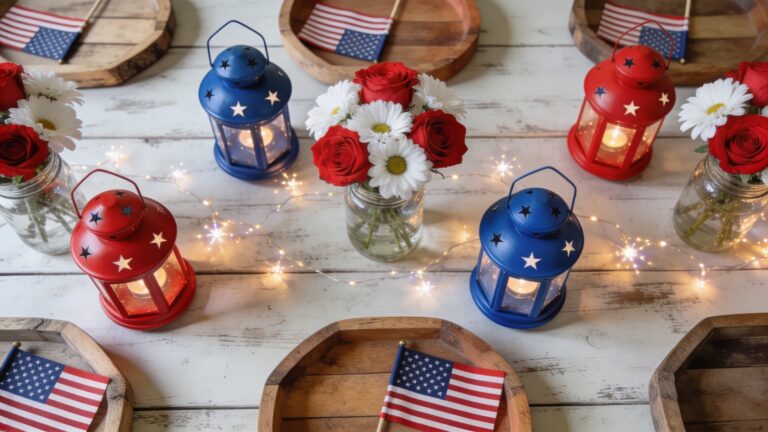
2 Patriotic Flag Door
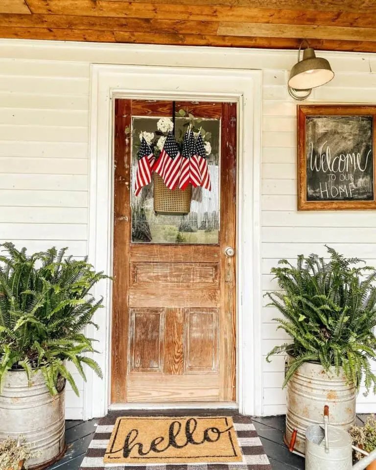


Hanging a pair of American flags on either side of a rustic wood door gives your entrance a bold, patriotic look without overdoing it. The flags frame the doorway symmetrically, drawing the eye straight to the entrance.
Metal bucket planters filled with greenery on both sides soften the look and add some natural contrast against the white siding. That combination of rough metal, wood grain, and leafy green keeps the display grounded rather than overly formal — exactly the right tone for a relaxed Fourth of July celebration.
3 Blue Door, White Siding
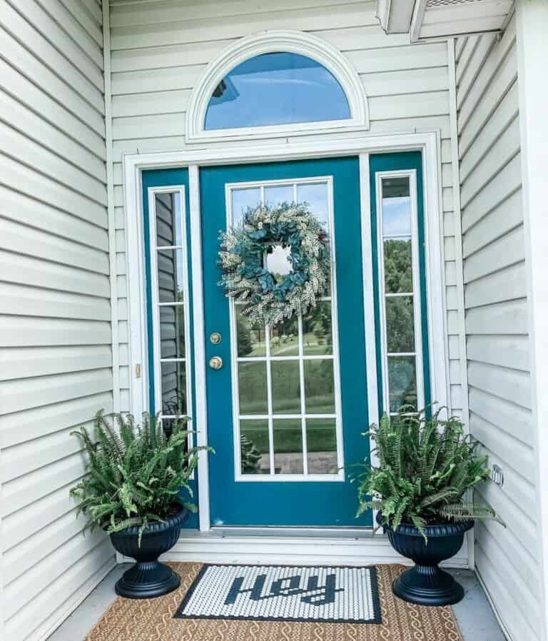


White siding gives your porch a clean, neutral backdrop that lets a bold blue door command full attention without competing colors pulling focus. Glass panels and a transom window add light and visual interest to the entryway.
Layering two doormats — like a natural jute base topped with a smaller patterned rug — adds texture and depth to the floor without any furniture. Matte black planters filled with lush greenery anchor the space and tie into the door’s hardware for a cohesive, pulled-together look.
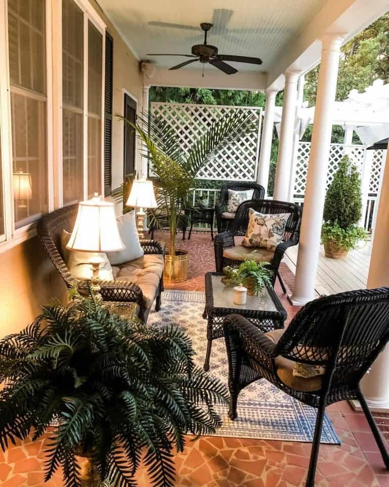
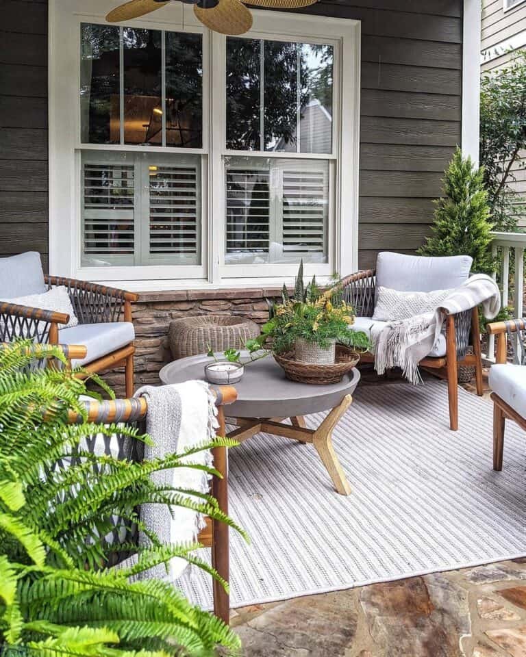
4 Natural Plants and Wicker


Wicker furniture and potted plants are a natural pairing for summer porches because both materials bring an organic, lived-in feel that plastic or metal furniture simply can’t replicate. A wicker sofa anchored on a black and white plaid rug gives the space structure without feeling too formal.
Grouping plants at different heights adds visual depth — try clustering a few terracotta pots near the porch steps alongside taller planters. Natural textures like rattan, jute, and wood complement the greenery rather than competing with it.
5 Pale Green Front Door
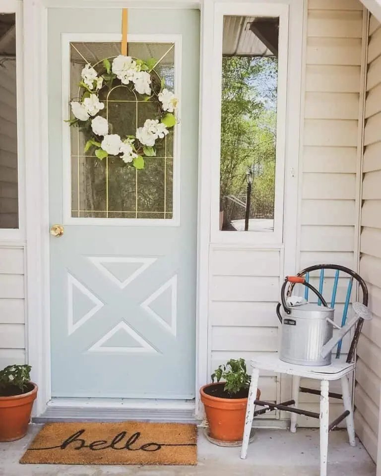


Pale green pairs naturally with terracotta, and this setup shows exactly why — the warm clay pots ground the soft, cool door color without competing with it. A white flower wreath ties the two tones together cleanly.
The spindle chair adds real personality here, with its mix of white, black, and blue breaking up what could otherwise feel too matchy. Rustic wooden furniture like this handles outdoor settings well because the texture adds visual weight.
Glass panels in the door let light pass through, making even a narrow entryway feel open and welcoming from the street.
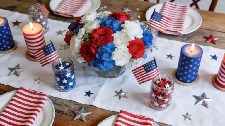
6 Patriotic White Porch
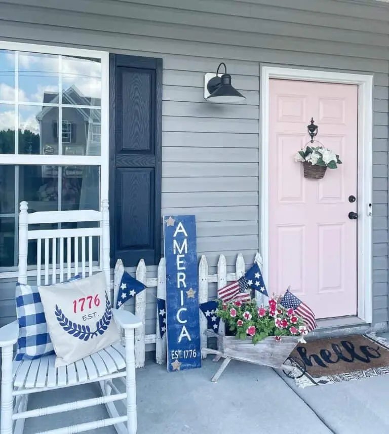


Red, white, and blue decorating gets tired fast when it leans too heavily on obvious flag prints everywhere. This porch keeps it fresh by anchoring the patriotic theme through small, intentional touches — a blue 4th of July sign, plaid pillow accents, and American flags tucked into a flower-filled wheelbarrow alongside pink blooms.
Layering a geometric rug under a doormat adds visual depth without cluttering the space. Black lanterns and shutters ground all the white elements, giving the porch contrast and structure that prevents it from feeling washed out.
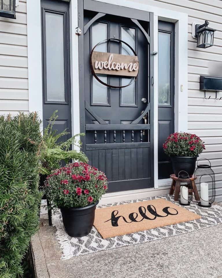
7 Dark Porch, Bold Flowers


Dark porches don’t need to be toned down — they need contrast. Vivid flowers in reds, yellows, and oranges pop hard against black pillars and dark brown Adirondack chairs in a way that muted colors simply can’t deliver.
A small side table between the chairs gives you a natural spot to cluster a few potted blooms without overwhelming the space. Marigolds, zinnias, or dahlias in mixed shades bring that punchy summer energy while keeping the overall look grounded in the rich, moody base you already have.
8 Brown Door Porch
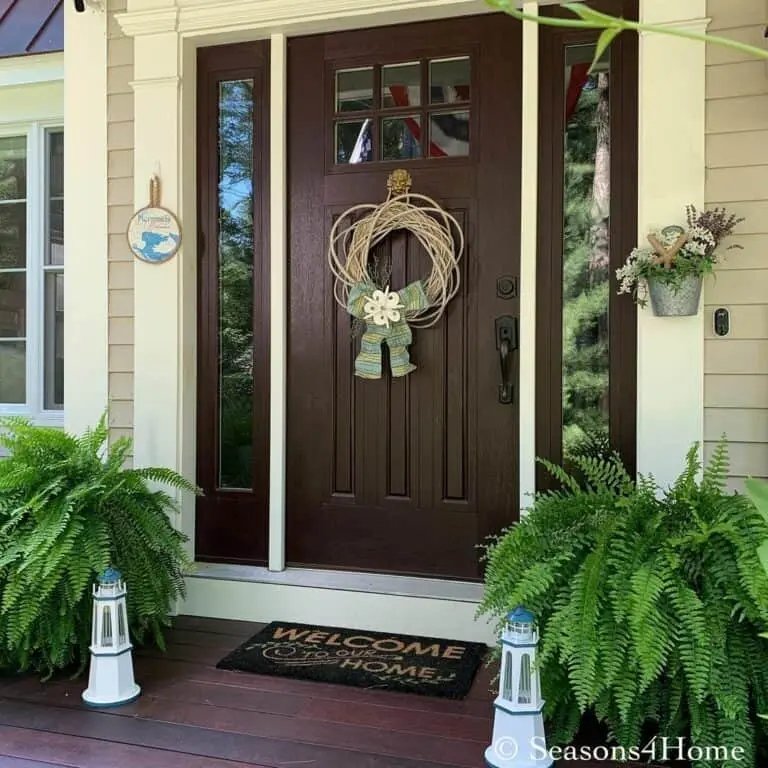


A warm brown door pairs naturally with coastal accents like lighthouse ornaments, since the earthy tone grounds the nautical theme without making it feel kitschy. Tuck them in front of potted greenery so the contrast between the white figurines and lush foliage draws the eye.
Sidelights on either side of the door give you a natural frame, making even a simple wreath feel intentional and well-placed. Small porches actually benefit from this kind of focused styling — fewer pieces with stronger visual contrast keep the space feeling curated rather than cluttered.
9 Black Wicker Furniture


Black wicker furniture sets a bold, grounded base that makes warm accents pop against it naturally. Pairing tan cushions with floral throw pillows in muted coral or dusty rose softens the contrast without losing that rich, defined look.
Two shaded table lamps add a warm amber glow once the sun dips, making the space feel lived-in rather than staged. Greenery — think potted ferns or trailing ivy — breaks up the dark tones and brings that fresh, summery energy that keeps the whole setup feeling light and inviting.
10 Black White Tasseled Rug
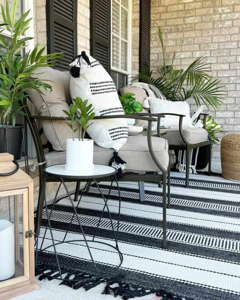


A black and white tasseled rug anchors the entire seating area, giving the metal armchairs and side table a defined, intentional spot to live. The high-contrast pattern draws the eye downward, making the space feel layered rather than flat.
Pairing the rug with beige cushions and accent pillows softens the bold graphic contrast without losing it entirely. Those neutral tones let the black and white pattern breathe, so nothing feels too harsh for a relaxed summer porch vibe.
The tasseled edges add a casual, textural finish that suits outdoor lounging perfectly.
11 Peach Front Door
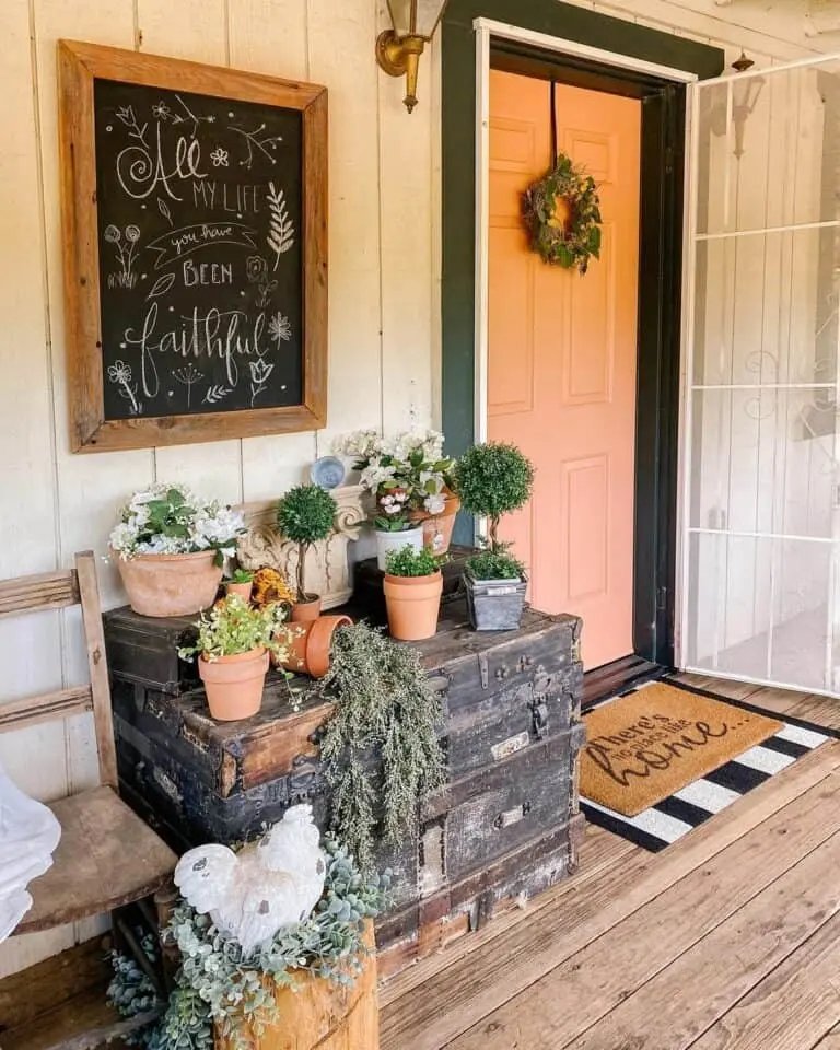

A peach front door sets a warm, sun-kissed tone that carries the summer palette right into your entryway. Layered doormats — think a natural jute base with a smaller patterned mat on top — add texture without cluttering the space.
An antique chest doubles as a display surface, giving terracotta pots and a framed chalkboard somewhere to live without feeling staged. Wood flooring ties the rustic elements together, keeping the overall look grounded and cohesive rather than mismatched.
12 Foliage and Flowers


Mixing foliage with flowers gives your porch layers of texture that feel lived-in rather than staged. Drape trailing pothos or ivy from hanging baskets near your seating area to add depth without crowding the space.
Pair bold tropical leaves like elephant ear or bird of paradise with soft blooms — think white gardenias or pale pink petunias — to balance drama with lightness. Clustering pots of different heights around a coffee table ties the greenery into your existing furniture arrangement naturally.
13 Teal Vine Porch


Climbing vines framing the porch exterior give this space a soft, lived-in charm that planted pots simply can’t replicate. They soften the architectural lines and draw the eye upward naturally.
Teal siding paired with crisp white window trim is a bold but grounded color combination — the white keeps the teal from feeling too heavy. Red and white cushions on the wicker furniture and rocking chair tie everything together with a pop of warmth.
White wicker handles outdoor humidity well and suits the relaxed, cottage-inspired feel this setup is going for.
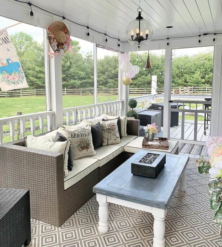
14 Wooden Beam Porch
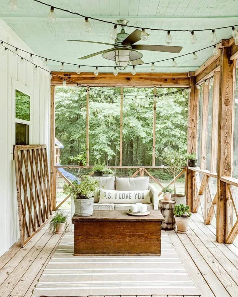


Wooden beams framing a porch give the space a grounded, cabin-like feel that pairs naturally with warm textures and earthy tones. Draping string lights across the ceiling ceiling adds soft ambient glow without overhead fixtures.
An off-white sofa keeps the palette light and airy, preventing the dark wood from making the space feel heavy. Pairing it with a rustic wooden coffee table ties the natural materials together cohesively.
Keep cushion fabrics in linen or cotton — both breathe well in summer heat and complement the raw wood tones without competing with them.
15 Pink Flower Planters


Pink flowers paired with deep black and crisp white create a sharp contrast that draws the eye straight to your entryway. Layering a door basket above potted planters gives the space vertical depth without crowding the floor.
Foliage-filled planters flanking the door add fullness and ground the pink blooms with green texture. Stacking two doormats — like a jute layer over a smaller pattern mat — adds dimension underfoot and ties the whole arrangement together.
16 Hanging Porch Plants
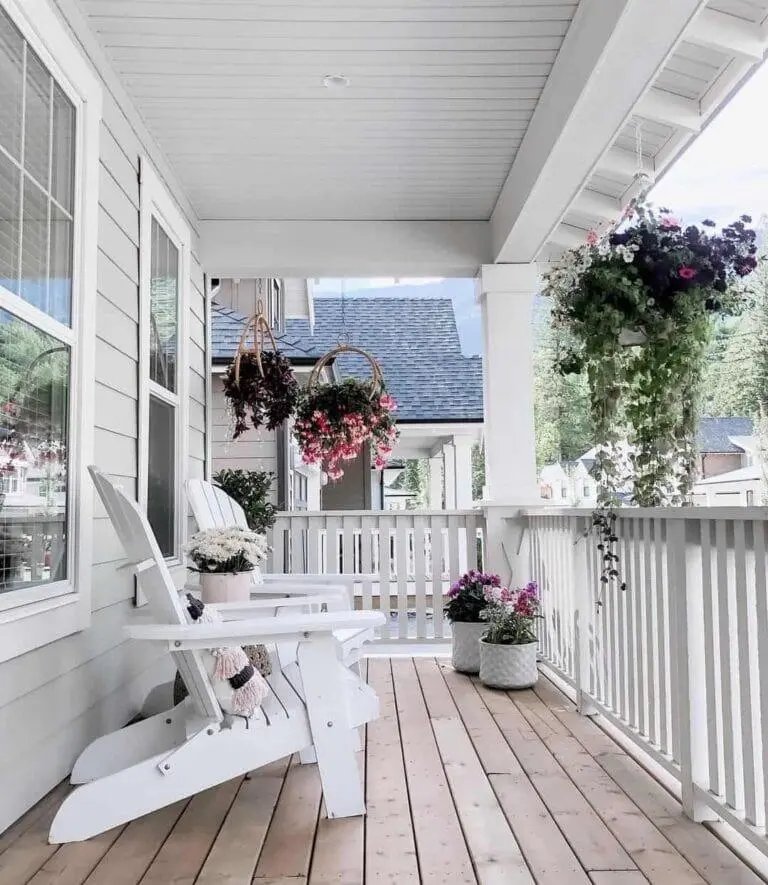


Hanging plants like trailing pothos or ferns add layered greenery without taking up floor or railing space. Suspended at different heights from porch ceiling hooks, they draw the eye upward and make the space feel more lush and lived-in.
White Adirondack chairs already bring a clean, classic look, so the plants add softness and color contrast against that crisp backdrop. Macramé hangers or simple wire baskets both suit this style well — just keep the containers consistent in material or color for a cohesive feel.
17 White Railing Porch


White railings give a porch an instant sense of structure without feeling rigid or formal. Paired with a black and cream pillow combination, they create a natural contrast that ties the space together visually.
A coffee table painted in white and gray tones keeps things cohesive without being too matchy-matchy. Placing it on a patterned mat grounds the seating area and defines the space, especially when your furniture arrangement includes a chaise lounge that could otherwise feel awkwardly positioned.
18 Blue Front Door
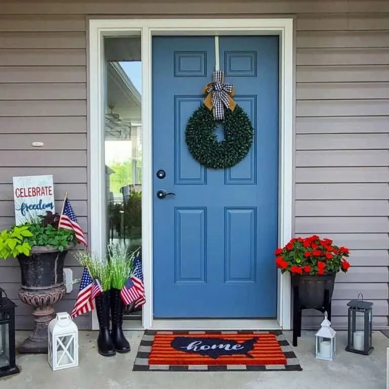


Blue paired with light gray siding gives your porch a crisp, coastal feel without trying too hard. The cool tones in the door actually make warm accents — like that vibrant orange doormat — pop harder than they would against a neutral backdrop.
Flags tucked into a planter and decorative boots add personality without cluttering the space. Small lanterns scattered near the entry keep things feeling layered and lived-in rather than staged.
This color combination handles different lighting well — the blue reads rich and saturated in full sun, then shifts softer and more relaxed in the evening shade.
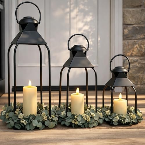
19 Farmhouse Lantern Sconces
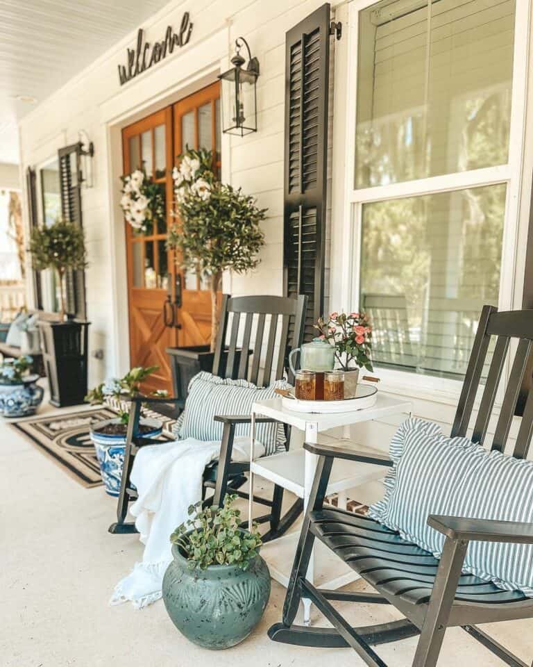


Lantern sconces mounted beside the front door pull double duty — they add warm, ambient light in the evenings and give the porch a polished, finished look during the day. Black metal finishes pair especially well with white siding, since the contrast keeps things sharp without feeling overdone.
Positioning them at eye level, roughly 66–72 inches from the ground, frames the entryway naturally. Flanking a set of low shrubs with sconces like this draws the eye upward and gives the whole facade a layered, intentional feel.
20 Brick Arch Porch
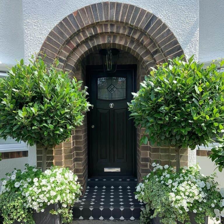


Brick and white stucco paired together give a porch structure and warmth without feeling heavy or overdone. The arch shape softens the strong lines of the brick, so the entryway feels inviting rather than imposing.
Black and white diamond tile on the floor adds sharp contrast that ties directly into the black front door — a simple way to make a compact space feel intentional. Flanking the doorway with low shrubs and white flowers keeps the color palette clean and frames the entrance naturally.
21 Teal Farmhouse Shutters


Teal shutters against white siding give this porch a sharp contrast that draws the eye without overwhelming the natural wood tones of the deck and front door. The cool blue-green shade sits comfortably in summer, feeling fresh against the heat without clashing with warmer materials.
Black sconces on either side of the door anchor the whole color palette together, connecting the darker wood tones to the crisp white pillars. That kind of tonal layering — warm wood, cool teal, clean white, matte black — keeps the porch feeling cohesive rather than random.
22 Brick Wall Vintage Porch


Exposed brick naturally suits vintage and rustic decor because the rough texture echoes aged wood and worn finishes. Pairing a wicker coffee table with an antique-style sofa keeps the look grounded and cohesive.
Vibrant accent pillows in bold colors — think deep mustard or burnt orange — give the seating area visual punch without clashing against the earthy brick backdrop. A black and white geometric mat beneath the furniture ties the space together and adds crisp contrast to all those warm, organic tones.
23 Gray Furniture Planters


Gray outdoor furniture paired with a matching patterned rug pulls a porch together without feeling overdone. The monochromatic palette actually lets your surroundings — like an open lawn view — do most of the visual heavy lifting.
White planters filled with leafy green foliage are the right contrast here, breaking up all that cool gray with something fresh and organic. Matte or textured planter finishes suit this setup better than glossy ones, since they blend into the neutral scheme rather than competing with it.
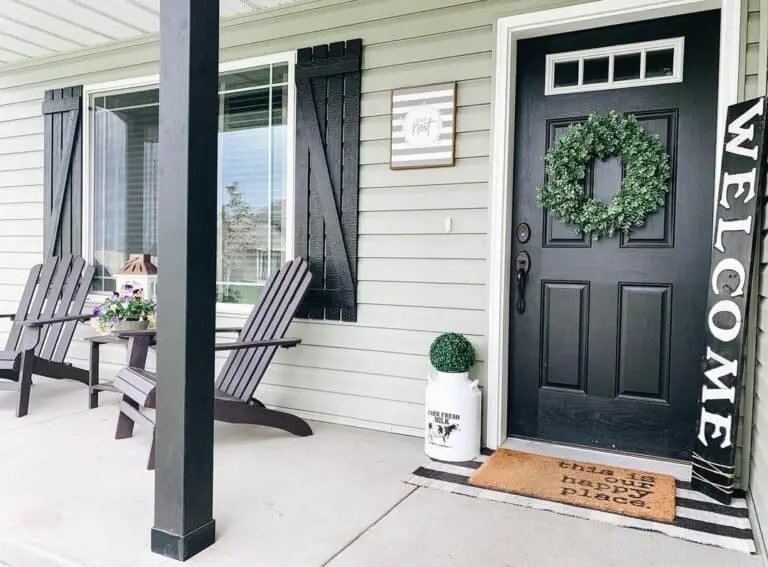
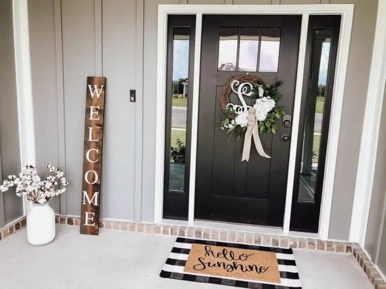
24 Black Door Entry


Black doors have a natural boldness that ties a whole entryway together, and layering textures in front softens that edge nicely. A striped outdoor rug underneath a rougher coir mat gives the concrete stoop some visual depth without feeling overdone.
Matching the screen door, front door, and side lights in the same black shade creates a cohesive frame around your entrance. That consistency draws the eye inward rather than scattering attention across competing colors.
A rustic wood welcome sign centered on the door adds warmth, balancing the crispness of the black paint with something that feels genuinely lived-in.
25 Wooden Chairs, Gray Cushions
![[Set of 2] Contemporary Minimalist Gray Wicker Rocking Chair with Soft Polyester Cushions and Durable Wooden Frame, Perfect for Indoor and Outdoor Spaces Like Patio, Balcony, or Living Room](https://m.media-amazon.com/images/I/51EBHvWyyxL._SL500_.jpg)


Natural wood and light gray are a reliable pairing for porch seating — the warm grain of the wood softens the coolness of the gray cushions, so neither element feels too stark. A circular table in the center keeps traffic flowing easily around the space.
Layering a striped outdoor rug underneath ties the whole seating area together visually. Stripes give the eye a clear boundary for the "room," which makes even a small porch feel intentional and pulled together.
White window trim on the house wall adds contrast that makes the natural wood tones pop even more.
26 Gray Board Batten Walls


Light gray board and batten adds quiet structure to a porch without competing with the surrounding landscape — especially when framed by a brick border that grounds the whole facade. That contrast between smooth painted panels and rough-textured brick gives the entryway a layered, finished look.
Layered doormats in front of a paneled black door with sidelights pull the eye inward and define the threshold. A white vase and wooden welcome sign kept simple on concrete flooring let the architectural details breathe rather than get buried under clutter.
27 Red Brick Steps
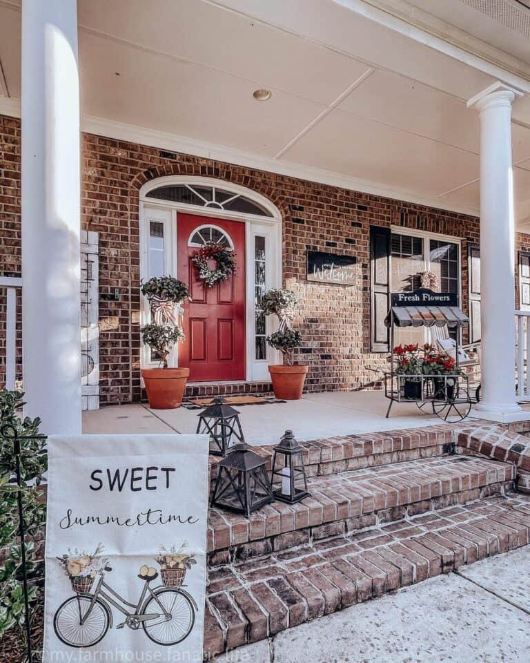


Red brick steps already have strong visual character, so your décor just needs to complement what’s already there rather than compete with it. Black lanterns suit this setup particularly well — the dark metal contrasts cleanly against the warm brick tones without clashing.
Flanking the door with potted plants softens the symmetry of the columns and gives the entrance a lived-in, welcoming feel. A simple wreath on a red door pulls the whole color story together, tying the warm brick to the greenery in one cohesive look.
28 White Adirondack Chair

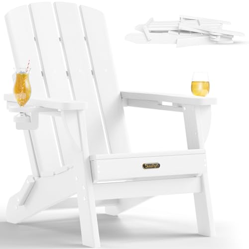

White Adirondack chairs have wide, flat armrests that are genuinely useful — enough space to hold a drink, a book, or a small tray without anything tipping over. Their slightly reclined angle naturally encourages you to slow down and settle in.
Navy and white striped or solid blue pillows add color contrast against the bright white frame without overwhelming the space. Pairing this setup against white door trim ties the whole porch together, giving it a clean, cohesive look that feels intentional rather than thrown together.